Graphing in Python - New(er) kids on the block

We are always going to need Matplotlib and Seaborn, but it is so great to see new Python plotting packages popping up in the past few years. In addition to showcasing them here, we will document the little tricks and gotchas that we come across along the way.
Plotly Express
Plotly does not need much introduction, as it is now very widely used to create interactive plots in both Python and R. For a while, one major drawback of Plotly is its rather inconvenient syntax, where the source data needs to be passed in as arrays even though most of us want to be able to plot data directly from dataframes.
With the release of Plotly Express with its succinct Seaborn-like one-liner syntax, however, the situation is now much improved. While not all Plotly graphs can be made this way, there is an impressive variety of plots available in the Plotly Express library, including interactive maps.
One small annoyance is that the legends in graphs made using Plotly Express are cluttered by the column names. Following the useful tip here, you can use the .for_each_trace() function call to remove them. For example, here we will replace species= with an empty space:
import plotly.express as px

iris = px.data.iris()

fig = px.scatter(iris,
                 x="sepal_width",
                 y="sepal_length").for_each_trace(lambda t: t.update(name=t.name.replace("species=","")))
Here is a collection of useful links curated by us for all things Plotly:
Yellowbrick
This package, built on top of Matplotlib, facilitates visualizing a variety of information from various stages of machine learning workflows. It is a sizable library, and looking through its API is an education in itself.
We have not had many chances to use Yellowbrick yet, but are looking forward to being able to delve deeper into this package in the future!
Plotnine
One of the strengths of the R language is its very powerful graphing package ggplot2, with its distinctive implementation of Leland Wilkinson’s Grammar of Graphics. The Plotnine package brings this (at least part of it, it seems for now) capability to Python, with very little change to the R syntax.
The brackets around the ggplot() function call looks strange at first, but it is needed for the signature multi-line ggplot2 grammer to work:
## Import libraries
import pandas as pd
from plotnine import *
from random import randint

# Generate dataset
random_numbers = [randint(1, 100) for p in range(0, 100)]

df = pd.DataFrame({'number': random_numbers})

# Draw plot
p = (
      ggplot(df, aes(x='number')) +
          geom_histogram(bins=20, na_rm=True) +
          ggtitle('Histogram of random numbers') +
          theme_light()
                        )

## Display plot
p.draw();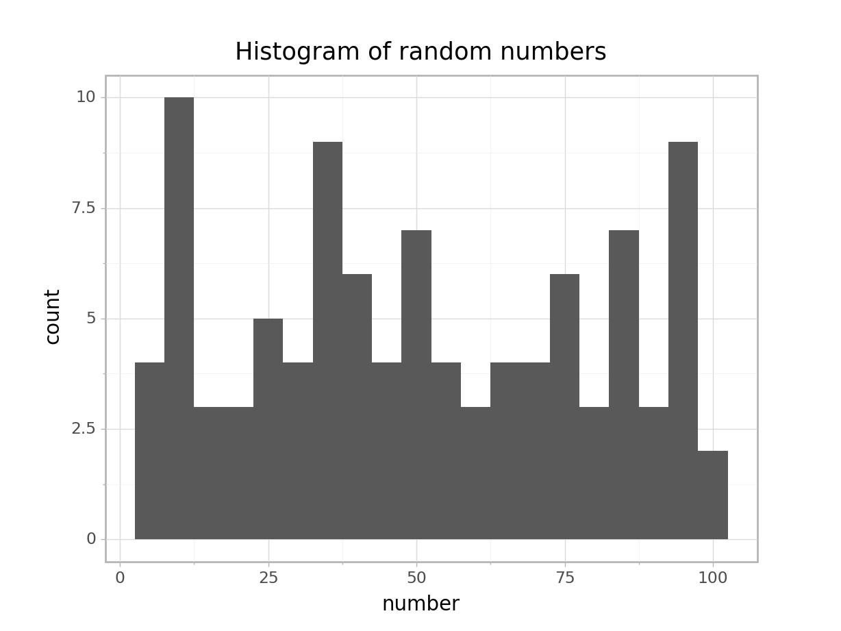
If you want to save the plot to file:
p.save("output.png")And just because I can see myself wanting to use these plots in a Streamlit app, here is a working template:
import pandas as pd
import numpy as np
from plotnine import *
import streamlit as st

n = 10

df = pd.DataFrame({'x': np.arange(n),
                   'y': np.arange(n),
                   'yfit': np.arange(n) + np.tile([-.2, .2], n // 2),
                   'cat': ['a', 'b'] * (n // 2)})

a = (
      ggplot(df) +
        geom_col(aes('x', 'y'))
                               )

fig = a.draw();   ## Needed to remove the "ggplot<#>" message

st.pyplot()
Finally, as always, here is a (ever growing) collection of links curated by us to get your started with using Plotnine: