Fast exploratory data analysis for when you just can’t wait

One of the most exciting things about data science is when you get your hands on a new dataset. Oh, the sense of possibilities when opening up a new dataset!
Unfortunately, before you can get to the fun stuff (though who said that EDA can’t be fun), it’s important to get an idea of its overall structure and potential problems. Here is a round up of our favourite packages for getting acquainted with a dataset while writing a minimum amount of code.
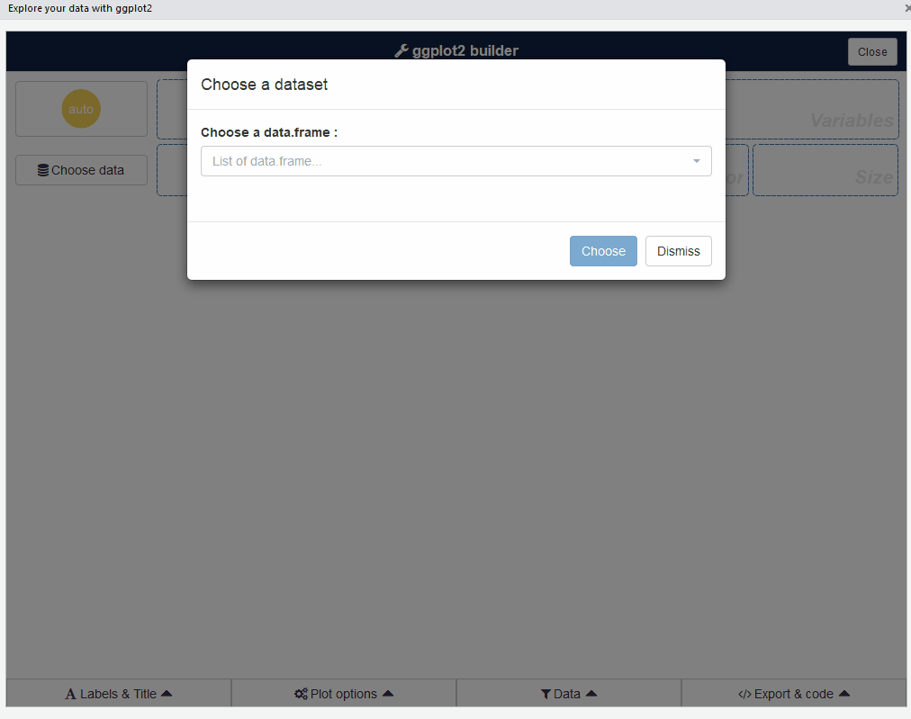
esquisse: interactive data exploration with ggplot2
If you are really impatient, esquisse is an RStudio addin that launches a point-and-click GUI for absolutely no-code interactive EDA. After drag-and-drop selection of the features that you want to visualize, it not only generates customized beautiful ggplot2 figures but also exports the code so that you can easily replicate them elsewhere.
From its official documentation:
esquisse can also be used as a module inside your Shiny application.
dataMaid: quality check of raw data
To quickly spot things like missing values, misclassified variables, and erroneous values, I prefer dataMaid for its straight forward combination of metrics and visualizations.
## Import library
library('dataMaid')

## Import data raw Telco customer churn dataset
raw_df <- read.csv("https://github.com/treselle-systems/customer_churn_analysis/raw/master/WA_Fn-UseC_-Telco-Customer-Churn.csv")
dataMaid generates a summary report of your dataset in R markdown format, which you can knit together into an PDF or HTML report. For demonstration purposes, I will just show snippets of the interesting parts:
## Generate report
makeDataReport(raw_df, openResult = TRUE, output='html',
               render = TRUE, file = "./auto_eda_report.Rmd",
               replace = TRUE, codebook=TRUE)
First part of the generated report shows the types of checks performed:

Then, we see a summary table of all variables, which provides a helpful quick overview of the data and any potential issues, like the 0.16% missing data in the TotalCharges column.

Scrolling down, there are more detailed information on each variable. We see problematic areas such as the customerID column being a key and that the SeniorCitizen column is encoded in 0s and 1s.

Also we see that the minimum value of Tenure column is 0, which is problematic and should be removed.

Of all the automated EDA packages in R and Python that I have tried so far, dataMaid provides the best once-over, quick-glance view of the whole dataset with a single function. These results are great for focusing the initial data cleaning process.
autoEDA: quick overview of cleaned data
Once I get a (reasonably) clean data set, I want to be able to explore the variables and their relationships with minimal coding (at first). This is where the next two packages come in, which provide varying degrees of flexibility and depth of insights.
For the first quick overview, I use the autoEDA package to explore the relationship between all input variables and my target variable of interest, which is Churn in this case. For maximum convenience, this is can be done in a single line of code:
## Import libraries
library(autoEDA)

## Import the same dataset, but with basic cleaning
cleaned_df <- read.csv("https://github.com/nchelaru/data-prep/raw/master/telco_cleaned_yes_no.csv")

## Correctly format the target variable
cleaned_df$Churn <- as.character(cleaned_df$Churn)

## autoEDA
autoEDA_results <- autoEDA(cleaned_df, y = "Churn",
                           returnPlotList = TRUE, verbose = FALSE)
The graphical outputs provided by autoEDA give very quick at-a-glance insights into how various aspects of customer demographics and behaviour relate to whether they churn or not. As there are many plots, one for each variable plus some more, I will show them in a nifty carousel made possible by the slickR package:
## Import libraries
library(svglite)
library(lattice)
library(ggplot2)
library(rvest)
library(reshape2)
library(dplyr)
library(htmlwidgets)
library(slickR)

## Create list of autoEDA figures converted to SVG
plotsToSVG <- list()

i <- 1

for (v in autoEDA_results$plots) {

  x <- xmlSVG({show(v)}, standalone=TRUE)

  plotsToSVG[[i]] <- x

  i <- i +1

}

## Custom function needed to render SVGs in Chrome/Firefox
hash_encode_url <- function(url){
  gsub("#", "%23", url)
}

## Pass list of figures to SlickR
s.in <- sapply(plotsToSVG, function(sv){hash_encode_url(paste0("data:image/svg+xml;utf8,",as.character(sv)))})

slickR(s.in, slideId = 'ex4',slickOpts = list(dots=T), width = '100%')
It is important to keep in mind that this type of bivariate analysis cannot detect combinatorial effects that exist among multiple variables to affect churn. Therefore, just because a variable do not appear to be differently distributed in terms of churn behaviour, such as Gender, it should not be excluded from analysis as it may be significant when considered in combination with other variables. Nevertheless, this is a good start for seeing if there are “learnable” signals in the dataset.
The output also includes a dataframe with summary statistics pertaining to variable type, presence of outliers, and descriptive statistics.
## Import libraries
library(knitr)
library(kableExtra)

## Preview data
kable(t(head(autoEDA_results$overview, 4)), colnames=NULL) %>%
kable_styling(bootstrap_options = c("striped", "hover"))| 1 | 2 | 3 | 4 | |
|---|---|---|---|---|
| Feature | Churn | Contract | Dependents | DeviceProtection |
| Observations | 7032 | 7032 | 7032 | 7032 |
| FeatureClass | character | character | character | character |
| FeatureType | Categorical | Categorical | Categorical | Categorical |
| PercentageMissing | 0 | 0 | 0 | 0 |
| PercentageUnique | 0.03 | 0.04 | 0.03 | 0.03 |
| ConstantFeature | No | No | No | No |
| ZeroSpreadFeature | No | No | No | No |
| LowerOutliers | 0 | 0 | 0 | 0 |
| UpperOutliers | 0 | 0 | 0 | 0 |
| ImputationValue | NO | MONTH-TO-MONTH | NO | NO |
| MinValue | 0 | 0 | 0 | 0 |
| FirstQuartile | 0 | 0 | 0 | 0 |
| Median | 0 | 0 | 0 | 0 |
| Mean | 0 | 0 | 0 | 0 |
| Mode | NO | MONTH-TO-MONTH | NO | NO |
| ThirdQuartile | 0 | 0 | 0 | 0 |
| MaxValue | 0 | 0 | 0 | 0 |
| LowerOutlierValue | 0 | 0 | 0 | 0 |
| UpperOutlierValue | 0 | 0 | 0 | 0 |
| PredictivePowerPercentage | 0 | 46 | 17 | 7 |
| PredictivePower | Low | Medium | Low | Low |
In the last row, there is a handy PredictivePower metric for each input variable with respect to a specified target variable. For now, we can ignore this as I will cover it in more details in a later post examining variable importance.
ExPanDaR: your own Shiny app for data exploration
ExPanDaR provides a really nifty Shiny app for interactive explorations of your data set. Originally designed for examining time-series data, the package requires the input dataframe to have a 1) time/date column and 2) a column that uniquely identifies each row. As the time/date column is only needed if you want to visualize time-dependent trends, to use a dataset without a time dimension you can just add a new numeric column (ts) with a constant and set that as the time dimension. An index column would suffice for the second requirement. In the original Telco dataset, the customerID column would have worked fine. As I had dropped it in the process of data cleaning, I will just add a new index column (ID).
## Import library
library(ExPanDaR)

## Add mock time column and new index to dataframe
cleaned_df$ts <- rep(1, nrow(cleaned_df))

cleaned_df$ID <- seq.int(nrow(cleaned_df))
To start up the Shiny app for interactive exploration of the results:
ExPanD(df = cleaned_df, cs_id = "ID", ts_id = "ts")Here are some snapshots of the features that I find most useful. The dropdown menus and sliders make it really easy and flexible to examine any combinations of variables.


To go beyond bivariate relationships, the scatter plot can aggregate information from up to four variables and really give some interesting insights.

There are some other very cool features like allowing the user to generate and explore new variables (from some arithemtic combinations of existing variables) on the fly and performing regression analysis. Definitely give this package a try!